Whether users stay in your online shop or abandon it is often decided in just a few seconds. On smartphones, mobile navigation plays a key role. It's not just a means of orientation, but also a direct gateway to your product range, services, and brand identity. If neglected, it becomes a barrier to conversion. However, if you optimize it specifically, it can be a massive lever for usability, engagement, and sales.
Especially with Shopify projects, it's clear time and again: the mobile menu is more than just a technical detail; it's a crucial first touchpoint. Tante-e founder Adrian explains in the podcast how retailers can maximize their navigation and optimize it specifically for small screens.

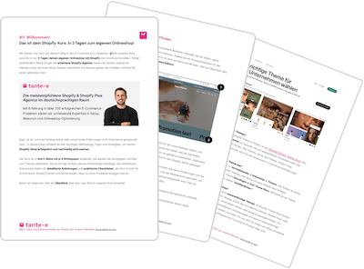
Shopify expert Adrian has already helped numerous brands with questions related to e-commerce and Shopify. He regularly shares practical knowledge in the tante-e podcast together with our other experts. This article is based on the episode on optimizing mobile menus ( YouTube / Spotify / Apple Podcasts ).
- Two central tasks of navigation on Shopify
- The building blocks of optimized mobile navigation
- Typical weak points in mobile menus
- Implement and specifically optimize mobile navigation on Shopify
-
Practical examples: How brands have solved their mobile navigation
- Ping Pong, AEVOR: Search & visual entry aids
- Kess Berlin: Combination of image and text
- Reisenthel: Search in focus, icons for orientation
- Naturtreu, Henssler's quick number: text-based & efficient
- Cazal Eyewear: Brand presence conveyed through design
- OACE: Sub-brand strategically integrated into navigation
- Peso, LFDY: Minimalist implementation
- Conclusion: Next steps towards optimized mobile navigation
1. Two central tasks of Shopify navigation
A good mobile menu on Shopify fulfills two core functions: navigation in the narrower sense, i.e. directing users to products, and orientation in the sense of a structural overview.
1.1. User guidance: Quickly and precisely to the goal
Navigation must enable users to get where they want to go with as few clicks as possible. To truly fulfill this function, it requires:
- Clearly prioritized entry points
- A menu structure with a maximum of two hierarchy levels
- A visible and intuitive search function in the mobile menu
- Focus on the most important product areas
The shorter the path to the product, the lower the bounce rate. The rule of thumb is: what isn't visible in the menu often doesn't even exist from the user's perspective.
1.2. Orientation: Show at a glance what the shop stands for
The menu is also a place for self-orientation: What does the shop offer? Which product areas are relevant? Which values or brand world play a role? Mobile navigation must answer these questions visually and structurally. Good orientation is achieved through:
- A clearly defined main structure (e.g. top sellers, new products, categories)
- Consistent designations without internal technical terms
- Visual cues such as icons, images or colors for classification
- A clear separation of shop content and service or information areas
Retailers who think about both functions together create a navigation that is not only functional but also has a brand-building effect.
2. The building blocks of optimized mobile navigation
If you want to improve your mobile navigation, you shouldn't limit yourself to visual changes or individual measures. In our experience, truly effective navigation is created through a clear structure, well-thought-out hierarchies, and deliberately placed visual elements. This not only guides your customers efficiently to their destination but also directly conveys what makes your store special.
2.1. Clear structure
Many menu structures have evolved over time and lack strategic logic. We often observe that unused categories, for example, are not removed or new content is added at random. The result is a confusing menu landscape that discourages users rather than guides them.
The first step towards better mobile navigation is therefore often a content-related one: questioning existing menu items, re-prioritizing them and streamlining them.
2.2. Hierarchies according to strategic relevance
Not everything is equally important. Therefore, the menu shouldn't be a list of equally weighted items. The navigation must clearly highlight what's central and, for example, highlight top sellers, seasonal offers, or particularly high-margin product ranges. Products, services, and information can be divided into levels according to this principle:
- Level 1: Main categories or product range focuses
- Level 2: Subcategories or thematic filters
- Level 3 (only if necessary): e.g. sub-filters or special landing pages
Important: The deeper the structure, the more clicks are required. Each additional level should therefore be used consciously and only when it provides real added value.
2.3. Visual guidance through colors, typography and icons
Visual elements can significantly improve navigation—when used purposefully. Colors, font sizes, or small icons help users more quickly understand which content belongs together and where to find relevant offers.
Elements that strengthen orientation:
- Color-contrasting main areas
- Icons for service links (e.g. shipping, returns, customer account)
- Typographic hierarchies (sizes, spacing, weights)
- Optional: small product images as an entry point into main categories
The following applies: Visual design supports a well-thought-out structure, but does not replace it.
2.4. Targeted content reduction
The challenge lies in focusing on the essentials in the navigation and outsourcing the rest, for example to the footer or to specific landing pages.
Typical optimization measures:
- Remove or move menu items that receive less than 1% of clicks
- Instead of a brand list in the menu: own brand overview page
- Instead of FAQ in the menu: well-linked service area in the footer
- Avoid using “about us” if it does not provide a clear introduction
In the podcast, Adrian puts it this way:
Less menu does not mean less content, but clearer communication.
3. Typical weaknesses in mobile menus
Many menus appear functional at first glance, but contain avoidable errors that negatively impact customer experience and conversion. We present the most common weaknesses in Shopify store navigation and how you can fix them:
3.1. Hidden or hard-to-find categories
A classic example: Important categories are located in deeply nested menu structures or aren't visually highlighted. Mobile users, in particular, scan content quickly. Things that aren't immediately discoverable often go unnoticed.
Typical causes:
- Unstructured menu logic without prioritization
- Unclear terms or overly generic names
- Balanced menu items without visual weighting
What helps:
- Focus on main categories with high relevance
- Maximum two navigation levels
- Clearly formulated titles related to product search
3.2. Bloated first navigation level
Too many main menu items overwhelm mobile users. The more equally important categories are displayed, the more difficult the decision becomes.
Typical signs:
- More than seven menu items on the first level
- No discernible sorting by importance
- Overarching categories that confuse rather than structure
Recommended measures:
- Reduce main menu items to the essentials
- Sorting by user behavior or strategic goals
- Outsource secondary content to footer, info area or landing pages
3.3. Lack of visual orientation aids
Mobile menus that are purely text-based offer few anchor points for quick comprehension. Icons, colors, or typography can help users more quickly understand where they are and what belongs together.
Lack of visual structure is expressed by:
- Same format text links without spacing or hierarchy
- No icons to distinguish between service and shop content
- Unclear separation between categories and additional content
Concrete optimization options:
- Use icons or small thumbnails to distinguish
- Introduce typographic hierarchies (e.g. through larger font or weight)
- Visual separation of shop areas and information such as shipping or FAQ
4. Implement and specifically optimize mobile navigation in Shopify
How do you implement these theoretical concepts in your Shopify mobile menu? A crucial factor here is your chosen theme base. In our projects with clients, we at tante-e consider a combination of functional clarity, technical feasibility, and continuous optimization.
4.1. What we consider when choosing a theme
Not every theme offers sufficiently well-thought-out mobile navigation. Many standard themes focus on the desktop view or provide only a reduced version of mobile menus.
Criteria that are decisive in the selection:
| feature | Why it is important |
|---|---|
| Menu structure with 2 levels | Avoids deep nesting |
| Clearly placed search function | Helps with direct entry into the product search, especially relevant for large product ranges |
| Support for icons / media | Enables visual orientation aids |
| Flexibility for adjustments | Allows individual menu logic or extensions |
| Good performance in mobile view | Fast loading times and smooth interaction |
We test each theme to see how quickly it can be adapted to the brand's respective strategy, whether through configuration in the theme editor or targeted custom coding.
4.2. Individual customizations vs. standard theme
Many shops start with a standard theme. While this makes sense in many cases, this approach reaches its limits when complex requirements arise, such as when additional layers, visual elements, or context-specific entry points are required.
Typical adaptations we implement in projects:
- Integration of visual entry points into main categories (e.g. thumbnails)
- Outsourcing of secondary links (e.g. shipping, login) to other locations
- Dynamic search function with direct preview
- Integration of sub-brands or lines with independent menu items
- Demand-oriented expansion of certain menu sections
4.3. Test and continuously optimize navigation
Whether mobile navigation works is demonstrated not only by its concept, but also by its active use by customers. Therefore, we rely on a data-driven approach with qualitative and quantitative methods for optimization.
Tools and methods for navigation evaluation:
- Heatmaps and scrollmaps for evaluating interaction depth
- Session recordings to observe real user movements
- Two-second test: What sticks in your mind after a quick glance at the menu?
- Segmented analysis of mobile vs. desktop behavior in navigation
Depending on the size of the shop, a focused testing period with clear hypotheses is often sufficient to identify structural weaknesses and remedy them specifically.
5. Practical examples: How brands implement their mobile navigation on Shopify
The requirements for mobile navigation are never identical. Brands differ in their product range, target audience, and tone – and the menu structure, visual elements, and entry logic should be just as individual. Below, we'll show how different brands have solved their mobile navigation problems using specific Shopify projects at tante-e. The focus is on functionality, clarity, and brand impact.
5.1. Pinqponq & AEVOR: Focus on search, visual entry points as a supplement
Both Pinqponq and AEVOR rely on a clearly visible search function directly in the menu for mobile navigation. This provides an effective entry point for users who already have a clear purchase intent. They also use visual elements such as icons or thumbnails to specifically highlight main categories. This creates quick orientation points and strong visual guidance.

5.2. Kess Berlin: Combination of image and text level
At Kess Berlin, the navigation was deliberately designed to give equal weight to text and images. Main categories are guided by clear labels, complemented by thematically relevant imagery. The result is a navigation system that not only provides orientation but also inspires. We recommend this approach for brand-oriented product worlds where emotions play a role.

5.3. Reisenthel: Differentiation via icons, search directly on the homepage
Reisenthel uses a navigation system with a significantly reduced main structure and deliberately uses icons for orientation. Particularly striking: the search function is prominently placed not only in the menu but also on the homepage. This makes mobile product searches the central entry point.

5.4. Naturtreu & Henssler's quick fix: Text-based navigation with a focus on efficiency
Both Naturtreu and Hensslers Schnelle Nummer deliberately avoid visual overload and instead rely on clearly structured, purely text-based navigation. Products are accessed via compact, logically structured menu items. Login, search, and shopping cart are also prominently placed outside the menu.

5.5. Cazal Eyewear: Brand presence conveyed through individual menu design
At Cazal Eyewear, we worked together to design the menu to reflect the brand's character in both design and language. The mobile navigation utilizes typographic contrasts and a minimalist color scheme. At the same time, it remains functional: The main categories lead directly to the products, and visual content supports orientation rather than distracting.

5.6. OACE: Subbrand integrated in the menu
OACE uses the navigation to integrate a sub-brand alongside the main brand. This sub-brand is visually separated and has its own entry area.

5.7. PESO & LFDY: Minimalist navigation, reduced to the essentials
PESO and LFDY rely on a deliberately minimalist menu without additional visual elements. Navigation is purely functional, supported by a prominent search function. The focus is on efficiency and clarity. Visual differentiation takes place within the product pages, not in the navigation itself.

6. Conclusion: Next steps towards optimized mobile navigation
Overall, navigation is a central element of the user experience, structuring content and playing a key role in whether users navigate the store or abandon it. This makes it all the more important to consider navigation not only from a design perspective, but also strategically.
When working with brands, we ensure that navigation is always seen as part of the overall design and not as a purely visual element. The best mobile navigation is the one that doesn't stand out because it works. Fast, intuitive, and targeted.