A good product page often makes the difference between your customers ultimately making a purchase or abandoning your site. But what exactly characterizes an optimized product page for Shopify stores, and what are the best practices?
In this article, we've compiled 10 tips for you and, using examples from successful Shopify brands, show you best practices for product pages. This way, you can gather inspiration for your own online store and specifically improve the customer journey.

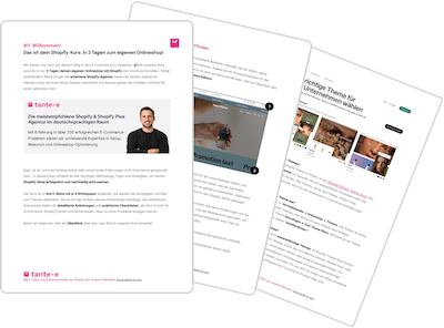
Our tips are based on our daily work at tante-e as an experienced Shopify agency. Content manager Maxi compiles the best examples from our projects and collaborations with various e-commerce brands.
- Optimize your Above The Fold design – the first impression counts
- Clearly communicate product benefits and added value
- Provide comprehensive and clear product information
- Visually highlight USPs and certifications
- Strengthen trust through social proof
- Reinforce purchasing decisions through supporting offers
- Clear call-to-actions (CTAs) for higher conversions
- Increase shopping cart value through cross-selling
- Provide inspiration through additional content
- Integrate user-generated content & social media
Our checklists & guides: Everything you need to get started with Shopify 🚀
1. Optimize Above The Fold – The first impression counts
The "above the fold" area—the visible part of the product page without scrolling—often determines the purchase. After all, it determines the first impression your customers get of your products. All relevant information must be immediately compelling. Our recommendations:
- High-quality product images & gallery: 360° views, videos or vivid illustrations help to make the product more tangible.
- Concise product name: Clear, SEO-optimized and understandable at a glance.
- USP icons & highlights: 3-5 bullet points or visual icons that highlight the most important benefits.
- Clear call to action: A clearly visible purchase button such as “Add to cart” or “Order now”.
- Trust elements: Immediately visible star ratings, return policies or security seals for more trust.

Best Practice: Boo
The D2C brand for freeze-dried fruits relies on a clear, concise design of the above-the-fold section:
- High-quality product images: A professional photo shoot presents the products vividly and colorfully.
- Short, concise USPs: The most important advantages are presented in bullet points.
- Social proof visible: Rating stars and the number of reviews are placed directly below the product name.
- Smart purchase incentives: A well-thought-out size selection, strikethrough prices and discount badges encourage purchases.
- CTA & availability indicator: The purchase button stands out clearly in color. Information about the product's immediate availability in stock further reinforces the decision.
Buah also integrates effective product sets into its shop. Learn more in the detailed case study .
2. Clearly communicate product benefits and added value
Customers want to understand at first glance why your product is the best choice. A clear, structured presentation of the key benefits facilitates the purchase decision and reduces uncertainty right from the start.
- Structured content: Provide comprehensive context through relevant information, but also ensure a clear overview – for example, through accordions or dropdowns for detailed information.

Best Practice: forpeople
The natural cosmetics brand relies on a well-thought-out structure that makes relevant information quickly accessible:
- Clear categorization: Benefits are clearly divided into tabs for description, effects, ingredients and product safety.
- Accordions for depth of detail : Customers find all the important information without being overwhelmed by long texts.
forpeople demonstrates how much can be achieved with a theme-based shop setup. Find out more in our case study .
3. Provide comprehensive and clear product information
The better a product is explained and visualized, the less uncertainty there is and the higher the likelihood of purchase. In addition to pure text descriptions, interactive elements and storytelling help make products more tangible. Here are our tips:
- Interactive displays: 360° views, animations or product videos can help show the product in action.
- Provide background information: Explain the manufacturing process, material composition or sustainability in an understandable way.
- Use storytelling & visual language: People don’t just buy products, they also buy stories and emotions.

Best Practice: 3Bears
The porridge brand combines various elements for optimal product presentation:
- Video portraits of the founders: They personally explain the quality and special features of the products, which creates authenticity.
- Porridge in action: Instead of just text, there are vivid preparation videos that bring the product to life.
- Structured FAQs: Frequently asked questions about preparation and ingredients are answered directly on the product page to eliminate any uncertainties.
Find out how3Bears works with us to continuously improve its shop and thus respond precisely to the needs of its customers.
4. Visually highlight USPs and certifications
To help customers quickly understand why your product is unique, the key selling points should be presented clearly and visually appealing. Icons, animated banners, or concise bullet points help convey key benefits at a glance.
- Place USP bullet points directly visible: Convince customers immediately of the added value of your product.
- Icons or animated banners: Facilitate quick, intuitive understanding of the benefits.
- Special certifications and unique selling points: Clearly indicate sustainable production, vegan materials or handcraft.

Best Practice: Guido Maria Kretschmer Shop
- Simple but effective icons: Information about the origin and fit of the clothing is conveyed using easy-to-understand symbols.
- Animated USP banner: Highlights key product benefits and draws attention to the most important selling points.
- Clearly structured information: No long blocks of text, but strategically placed added value that immediately convinces customers.
Find out exactly how Guido Maria Kretschmer approached the migration to Shopify and the store launch.
5. Strengthen trust through social proof
Customers rely on the experiences of others before making a purchase decision. Strong social proof—in the form of ratings, customer photos, or detailed reviews—builds trust and reduces uncertainty. Here are our tips:
- Powerful apps: We often recommend Reviews.io or Judge Me for implementing reviews.
- Place reviews prominently: Top reviews and star ratings should be visible directly in the above-the-fold area.
- Include real customer photos and videos: Authentic photos and clips help potential buyers get a realistic picture of the product.
- Offer filterable reviews: By clearly structuring or highlighting particularly meaningful reviews, customers gain confidence in their purchase decision more quickly.
Which apps should every Shopify merchant know? Find out in our comprehensive Shopify Apps Guide .

Best Practice: Kloster Kitchen
- Detailed rating structure: In addition to the overall rating, individual criteria such as taste, sweetness or spiciness of the ginger shot are given.
- Customer photos as social proof: A gallery with uploaded customer photos shows how the product is used in practice.
- Structured review section: Product ratings are clearly divided into reviews and customer questions, so that interested parties can find the information relevant to them.
- Social proof in variant selection: Customers receive taste ratings for different product sets to help them make better choices.
6. Reinforce purchase decisions through supporting offers
Even if a product is compelling, remaining doubts can delay the purchase decision. Supportive features such as size charts, live chats, or product comparisons help reduce uncertainty and sustainably increase conversion rates.
- Size charts & fit advice: Especially important for fashion, shoes and accessories to reduce returns.
- Live chat or chatbots: Direct help for spontaneous questions and uncertainties.
- Product comparison tools: Ideal when there are multiple variants or bundle offers.

Best Practice: Rich & Royal
- Saiz's integrated size calculator: Customers enter their height, weight, and body type to find the ideal size.
- Reduced return rate: The right recommendation helps avoid wrong purchases.
More information about the Rich & Royal shop relaunch can be found in our detailed case study .
7. Clear call-to-actions (CTAs) for higher conversions
A well-placed and visually appealing call to action (CTA) can provide the decisive impetus for a purchase. If the purchase button is difficult to find or not mobile-optimized, potential customers often abandon the site. We therefore recommend:
- Prominent placement: The “Add to cart” button should immediately catch the eye and stand out clearly in terms of color.
- Mobile optimization: Especially on smartphones, a sticky CTA or floating element can help keep the button visible.

Best Practice: pinqponq
- Eye-catching CTA button: Clear contrast and large font ensure clear visibility.
- Sticky CTA on mobile devices: The button remains visible at all times while scrolling, giving customers a clear view of the purchase process.
8. Increase shopping cart value through effective cross-selling
Targeted cross-selling can effectively increase the average shopping cart value by suggesting complementary or matching products directly on the product page. Instead of purely random recommendations, we particularly recommend personalized suggestions or complementary bundles.
- “Combine with” sections: Recommended items that complement the main product (e.g. accessories, spare parts or matching styles).
- Discounted bundles: Combination offers including a clear breakdown of the components and savings promote additional sales.
- Dynamic recommendations: Personalized suggestions based on customer behavior.

Best Practice: BATH SOFA
- Elegant cross-selling through mix & match: Customers can put together individual sets, e.g., a back cushion with a matching foot cushion.
- Price savings as a purchase incentive: Clear presentation of the savings on bundle purchases.
- Variant selection directly on the product page: Allows you to quickly adjust the desired combination without having to change the page.
- Additional classic cross-sell area: Further down on the product page, additional complementary products are suggested to create further purchasing impulses.
9. Provide inspiration through additional content
High-converting product pages on Shopify not only provide information but also inspire. Additional content—such as recipe ideas, styling tips, or usage scenarios—helps customers better understand the benefits of the product and encourages them to purchase.
- Show product applications: Recipes, styling ideas or tutorials make the product tangible.
- Integrate multimedia content: Videos, blog articles or interactive instructions ensure greater engagement.
- Create relevant links: References to suitable content (e.g. food recipes, DIY ideas for home & living).

Best Practice: Henssler's Quick Number
- YouTube videos on the product page: TV chef Steffen Henssler shows you how to cook with his frying oils.
- Links to relevant recipe blog articles: Customers immediately find inspiration on how to use the products.
- Content as part of the customer journey: Instead of just selling, the brand positions itself as a helpful companion in everyday life.
Learn more about how Henssler's Schnelle Nummer effectively combines inspiring content and e-commerce.
10. Integrate user-generated content and social media
Customers trust real experiences and are happy to be inspired by other shoppers. User-generated content (UGC)—customer photos, social media posts, or testimonials—brings authenticity to product presentation and strengthens trust in the brand.
- Include Instagram feed or customer photos: Show how the product is used in real life.
- Highlight mentions: A “Featured in” section with mentions in magazines or influencer posts creates credibility.
- Use community content as a purchase incentive: Styling ideas or application videos help to make the product more conceivable.

Best Practice: HORST
- Community Inspirations Section: Customer photos and interior influencers show how the wall colors look in the living space.
- “As seen in” section with press mentions: Strengthens brand reputation through well-known names.
- Highlighted customer testimonials: Testimonials and personal experiences are prominently displayed to convince new buyers.
In the detailed case study you will learn more about how HORST creates a world of inspiration with Shopify.