Maestrooo's Prestige theme is an established Shopify theme with a minimalist design and a solid code base. It's particularly well-suited for fashion brands and shops that value a streamlined look and clear product presentation. With 28 sections, it falls significantly short of the current market average (40+), but offers a stable foundation for custom development. For those requiring more flexibility, we recommend exploring alternatives like Impact, Stretch, or Aurora.
It has been a part of the Shopify ecosystem for years. It's no wonder it's considered one of the most popular theme options in the official Shopify Theme Store – and has earned a reputation as a solid, minimalist solution. Many describe the look of the Prestige theme as the "signature Shopify look": clean, clearly structured, with a focus on the products.
But what about today? Does the theme still have its place – or has it been overtaken by more flexible, modern alternatives? In projects with a clear brand aesthetic and a focus on product photography, we were able to launch shops very efficiently using the Prestige theme. However, as soon as multiple campaign landing pages or highly varied page types were required, the theme's limitations became apparent.
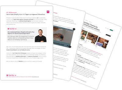
In this article, our Shopify expert Vincent shares his experiences: What can the theme still do today, where are its limitations – and for which shops is it still a sensible choice?

Vincent has successfully set up countless online shops at tante-e. He regularly shares his in-depth knowledge of themes in the tante-e podcast. This article is based on his analysis of the Prestige theme (available on YouTube / Spotify / Apple Podcasts ).
- What is the Shopify Prestige Theme?
- Who is the Prestige Theme suitable for?
- Features and Sections
- Menu and navigation
- Category page (Collection Page)
- Product Detail Page
- Shopping cart and cross-selling
- Code quality and extensibility
- Mobile Performance
- Strengths of the Prestige Theme
- Weaknesses and limitations
- Alternatives to the Prestige Theme
- Conclusion: When is prestige the right choice?
1. What is the Shopify Prestige Theme?
The Prestige theme is developed by Maestrooo – one of the most experienced and established theme developers in the Shopify ecosystem. Maestrooo is also responsible for other well-known themes such as Impact, Stretch, and Warehouse.
Price: US$400 (one-time payment)
The price has adjusted over the years and is now in the upper middle range of the Shopify Theme Store. Compared to the past, the theme has become more expensive – but it still falls within the usual range for established premium themes. Since it's a one-time payment, the price discussion is relative: two to three hours of agency work cost about the same.
Rating in the Shopify Theme Store: 91% positive
This rating is solid, but not outstanding. Many newer themes in the store achieve 100% positive reviews. However, it's important to consider that the Prestige theme has been rated since 2018 – over such a long period, a 91% rating is quite respectable.
The theme is officially listed in the Shopify Theme Store and is still actively maintained. It is one of the popular paid themes and can be found on the first page of the relevant category.

2. Who is the Prestige Theme suitable for?
The Prestige theme is designed with a minimalist aesthetic. It impresses with clear structures, a reduced design, and a clean, uncluttered appearance. The products take center stage – without visual distractions.
Target audience:
- Fashion brands: clothing, accessories, shoes – anywhere where large visual areas and product photography are the focus.
- Brands with a reduced brand presence: Minimalistically positioned brands that focus on clean lines and whitespace.
- Teams with limited resources: The theme is easy to manage and doesn't require a lot of manpower for maintenance.
In practice, we frequently use the Prestige theme for fashion brands that work with manageable, visually strong collections and primarily generate their focus on category and product pages.
When other themes are a better fit:
When individual landing pages, extensive content areas, or highly differentiated page structures are required, the design options of the Prestige theme reach their limits. In such cases, more flexible themes offer greater scope.
An overview of the best and most recommended Shopify themes.
3. Functionality and Sections
The Prestige theme comprises 28 sections (or 29 if you include the empty Liquid section). This is significantly below the current market average of over 40 sections.
This number is outdated . Modern themes offer significantly more flexibility – especially since Shopify's theme editor now resembles a page builder. With only 28 sections, the design options are noticeably limited.
What does that mean in practice?
The existing sections allow you to set up a solid, functional online store. The range of functions is sufficient for standard pages such as the homepage , product pages , and category pages .
Problems arise when individual landing pages , campaign-specific pages , or special content formats are needed. Then, the necessary building blocks are simply missing.
4. Menu and Navigation
The menu structure of the Prestige theme is functional, but not particularly impressive. Important features that are now standard are missing on mobile devices – the desktop version offers a solid, but limited, mega menu.
Mobile Menu:
The visual hierarchy is limited. E-commerce-relevant entry points (shop categories) are positioned at the top, account areas at the bottom – that's fine. Beyond that, however, there's hardly any room for customization.
What's missing: Thumbnails and visual highlights are not available on the third navigation level. Other themes now offer the option to add images to or visually highlight specific categories – this is not possible in the Prestige theme. The structure remains purely text-based.
Desktop Mega Menu:
The mega menu allows for two promotional images. The structure is clean and clear – a distinct advantage over some other themes that are less user-friendly in this regard.
However, there is only one type of mega menu . Other themes now offer three to four different mega menu variations, allowing for the implementation of different navigation structures.
Classification:
To be fair, it must be said that other themes also struggle with truly good mobile menus. For shops with a wide product range or international navigation, we recommend replacing the Prestige theme's mobile menu with custom solutions to enable visual hierarchies and faster access.
Out-of-the-box, the navigation is sufficient primarily for clearly structured, smaller product ranges .
5. Category page (Collection Page)
The category page in the Prestige Theme is functional and uncluttered – but offers room for flexibility.
Display options:
The product grid can be adjusted in terms of spacing and information density. For example, you can choose whether or not the price and title should be displayed below the products. The direct add-to-cart button is discreetly designed as a small plus icon – this looks aesthetically pleasing and doesn't take up too much space.
The typography and layout of product information (title, price, further details) are clearly structured. The product grid is visually appealing.
What is missing:
- Bubble navigation: Many modern themes offer the option to include quick links to other categories as bubbles at the top of the page. This allows users to quickly jump between categories without having to reopen the menu. This feature is missing in the Prestige theme.
- Promo banners in the product grid: Especially in campaign-driven shops – for example, with sale phases or membership models – we regularly find that the Prestige theme lacks the ability to place promotional elements directly in the product grid. In such cases, we either resort to custom solutions or recommend more flexible themes from the outset.
Filter navigation:
A positive feature to highlight is that the navigation structure can be defined in the filter. This means that categories are also accessible via the filter – a practical function that other themes don't always offer.
6. Product Detail Page
The product page in the Prestige theme makes a good visual impression. It is clearly structured and easy to navigate – both on desktop and mobile devices.
Layout flexibility:
One particularly positive feature: product information can also be positioned below the gallery . This isn't always the case. Many themes leave a lot of white space to the left of the product gallery on desktop, especially if the gallery is displayed as thumbnails rather than stacked vertically. The Prestige theme allows you to use this space effectively by strategically moving product information below the gallery, resulting in a more cohesive overall appearance.
Gallery and product information:
The image gallery is clearly structured. Even on mobile devices, thumbnails of the following images are available – an important detail. Users don't have to swipe through the entire gallery to find, for example, specifications in the third image, but can click on them directly.
The layout of the title, price , and other product information is clear and uncluttered. There are sections for specifications and icons – however, these are not yet optimally designed and require minor adjustments to look truly good.
Mobile optimization:
The product page works very well on mobile devices . The responsive design is solid, the visual hierarchy is maintained, and the user interface is intuitive.
Product Variants Feature:
A useful feature: The "Product Variants" block allows individual products on the product page to be linked as if they were variants. This is relevant, for example, if a T-shirt in five colors is not set up as one product with five variants, but as five separate products. These products then appear individually in the category – but on the product page, they can be displayed and linked as color variants.
7. Shopping cart and cross-selling
The shopping cart in the Prestige theme is implemented as a drawer – that is, as a panel that slides in from the side. The design is clean and uncluttered, and it works well.
Cart Drawer Design:
The product display in the shopping cart is generously designed. The products are given a relatively large amount of visual space, which enhances the overall impression. The "Proceed to Checkout" button is fixed at the bottom, so it remains visible even with multiple products in the cart – an important detail for conversion rates.
At the top of the shopping cart, a progress bar for free shipping is displayed ("X € more until free shipping"). However, this bar has a very basic design and could be more visually appealing. We would make adjustments here in practice.
Upsell features:
There is a cross-sell/upsell section in the shopping cart. However, this is not connected to the Shopify Search & Discovery app . This means that product recommendations must be maintained manually – either as universal products for all shopping carts or via meta fields at the product level.
This is a clear disadvantage. Most modern themes now offer the option of using the Search & Discovery app – either with rule-based recommendations or with Shopify's automatic product suggestions. The Prestige theme lacks this integration. Anyone wanting to display individual, product-specific recommendations will need custom programming .
8. Code quality and extensibility
The Prestige theme 's codebase is solid and clearly structured. This is an important point – especially if the theme is not only to be used out-of-the-box, but also as a basis for individual customizations.
Developer perspective:
In several projects, the Prestige theme served as the technical foundation upon which we selectively added our own sections and features – without having to work against a complex theme structure. This stability is a major advantage, especially for long-term shop setups.
Suitability as a basis for custom development:
If a shop needs a solid, proven theme foundation upon which individual customizations can be made, the Prestige Theme is an excellent choice. Its code quality allows for the targeted development of custom sections, functions, or design modifications without the theme structure getting in the way.
Many brands use the theme precisely for this reason: as a stable foundation upon which they can then build with agency support or internal development resources. In this use case, the theme truly shines.
9. Mobile Performance
The Prestige theme looks great on mobile devices. The responsive design is well thought out, and the interface is intuitive to use on mobile devices.
Responsive Design:
All sections available in the theme function flawlessly on mobile devices. There are no sections that look bad or are unusable on mobile devices. This sounds obvious, but it isn't. Other themes often have sections that are displayed questionably on mobile or where content is stacked endlessly, forcing users to scroll indefinitely.
Best practices on mobile devices:
Visual hierarchy , usability , and performance are well implemented on mobile devices. Buttons are easily accessible, text is legible, and spacing is well-placed. The sections are structured to function effectively even on smaller screens – without content appearing cramped or cluttered.
This is a particularly important point for fashion brands , where mobile traffic often accounts for the largest share. The Prestige theme delivers reliably in this regard.

10. Strengths of the Prestige Theme
The Prestige theme has clear strengths that make it a viable option despite its limited flexibility.
Minimalist, aesthetic design:
The minimalist look is consistently implemented. Everything appears tidy, clearly structured, and visually appealing. The typography is well-chosen, spacing is sensible, and the product presentation takes center stage – without visual distractions.
Easy to use:
The theme is clear and intuitive to use. Teams with limited resources can easily manage without having to wade through countless settings. Maintenance is straightforward.
Solid code base:
The technical foundation is stable and well-structured. Anyone wishing to use the theme as a basis for individual development will find a clean starting point.
Mobile Performance:
The theme works perfectly on mobile devices. All sections are responsive, the interface is intuitive, and the visual hierarchy is maintained.
Established status:
The theme has been used for years, is continuously maintained, and has been extensively tested. Comprehensive documentation is available, and many developers are familiar with its structure.
11. Weaknesses and limitations of the Prestige Theme
As solid as the Prestige theme is in many areas, there are clear weaknesses that should be taken into account when making a decision.
Manageable sections:
With 28 sections, the theme falls short of the current market standard. This limits flexibility when individual landing pages , campaign-specific pages , or differentiated content formats are needed.
Missing features on the category page:
Bubble navigation and promo banners in the product grid are missing. Both are now best practices and standard in many modern themes.
Limited menu flexibility:
The menu structure – both on mobile and desktop – offers little room for customization. Visual hierarchies , image backgrounds at the third level , or different mega-menu types are not possible.
No integration with Search & Discovery in the shopping cart:
Product recommendations in the shopping cart must be maintained manually . Automatic integration with Shopify's Search & Discovery app is missing – a clear disadvantage compared to more flexible themes.
Recognizable look:
The "signature Shopify look" of the Prestige theme is widely known. Those who need a highly individual brand presence will have to customize the theme accordingly – or resort to alternatives.
Prestige Theme – Strengths & Weaknesses at a Glance
| Strengthen | Weaken |
|---|---|
| Minimalist, timeless design | Significantly below-average number of sections (28) |
| Excellent mobile performance | Limited flexibility for landing pages & campaigns |
| Clean, stable code base | Inflexible menu and mega-menu structure |
| Easy maintenance, low complexity | No integration with Shopify Search & Discovery in the shopping cart |
| Proven theme with years of use | Recognizable “Signature Shopify Look” |
| Very well suited as a basis for custom development | Many modern best-practice features are missing out-of-the-box. |
12. Alternatives to the Prestige Theme
Those who appreciate the strengths of the Prestige theme but need more flexibility should consider the following alternatives. All three are either from Maestrooo or offer similar starting points – with extended functionality.
Impact Theme (Maestrooo):
The Impact theme , also developed by Maestrooo, offers significantly more sections and design options than the Prestige theme. It is suitable for brands that require more visual flexibility but still want to rely on Maestro's proven code structure.
Stretch Theme (Maestrooo):
The Stretch theme also comes from Maestrooo. It's specifically designed for fashion brands and includes more features relevant to this segment. Anyone working in the fashion industry who appreciates the minimalist aesthetic of the Prestige theme should definitely check out the Stretch theme.
For a detailed analysis of the Shopify Stretch theme
Aurora Theme:
The Aurora theme isn't from Maestrooo, but it offers a very good foundation that can also be customized in a minimalist way. With some adjustments, a similar aesthetic to the Prestige theme can be achieved – with significantly more flexibility in design options.
All three themes can be configured to meet the minimalist requirements of the Prestige theme – but offer more scope for individual customizations and specific requirements.
13. Conclusion: When is prestige the right choice?
The Prestige theme will still be a solid option in 2026 – but not for every shop. The decision should clearly depend on your own requirements.
The theme is suitable if:
- Minimalist aesthetics and a reduced look are paramount.
- The products themselves should speak for themselves – without visual distractions.
- A clear, easy-to-maintain theme is needed.
- The team has limited resources and does not want to manage complex structures.
- A stable code base for later individual development is desired.
- Fashion products or similar visually focused assortments are sold
The theme is not suitable if:
- Individual landing pages, extensive content areas, or campaign-specific pages play a central role.
- Maximum flexibility in design is required.
- Modern features such as bubble navigation, promo banners in the product grid, or automated product recommendations are indispensable.
- A highly individual brand presence, deviating from the classic Shopify look, is desired.
We continue to use the Prestige theme at tante-e in selected projects. It's a proven foundation – especially for shops with a clear visual identity and a focus on product presentation. At the same time, we now recommend more flexible alternatives in many cases, offering greater design freedom.
Our recommendation: Always make theme decisions by comparing different options. Weigh the Prestige Theme against two or three alternatives – and clearly prioritize your own requirements.